New Logo and Branding
Adelco has undergone a brand transformation after more than forty years using our original logo.
Then....
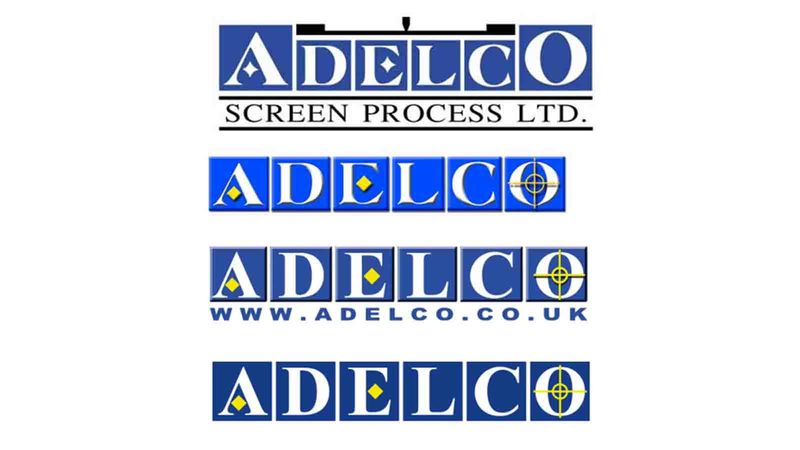
Adelco was started in 1972, to manufacture screens, art and design for electronic components, circuit boards and cosmetic toiletry containers. The logo reflected this, the squares and the yellow printing marks are all a nod to the screens that Adelco originally produced.
The logo has moved with the times in subtle ways over the years, as you can see below, the changes are modest but still in keeping with our original purpose.
Now…..
Today Adelco has evolved and has a very different purpose than when it was originally started. Currently we design and manufacture state of the art textile screen printing and drying machines. We use the most advanced technology to ensure our products are the leading textile solutions on the market.
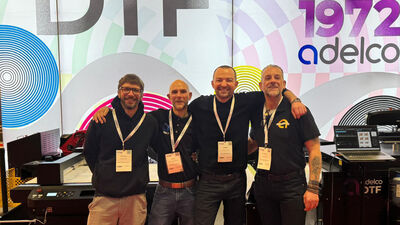
We have a large manufacturing facility that has grown substantially in the last few years, as well as a busy and dynamic R & D department that has been leading the industry with high tech developments for many years. We have a strong team of partners around the world championing our products to their own territories.
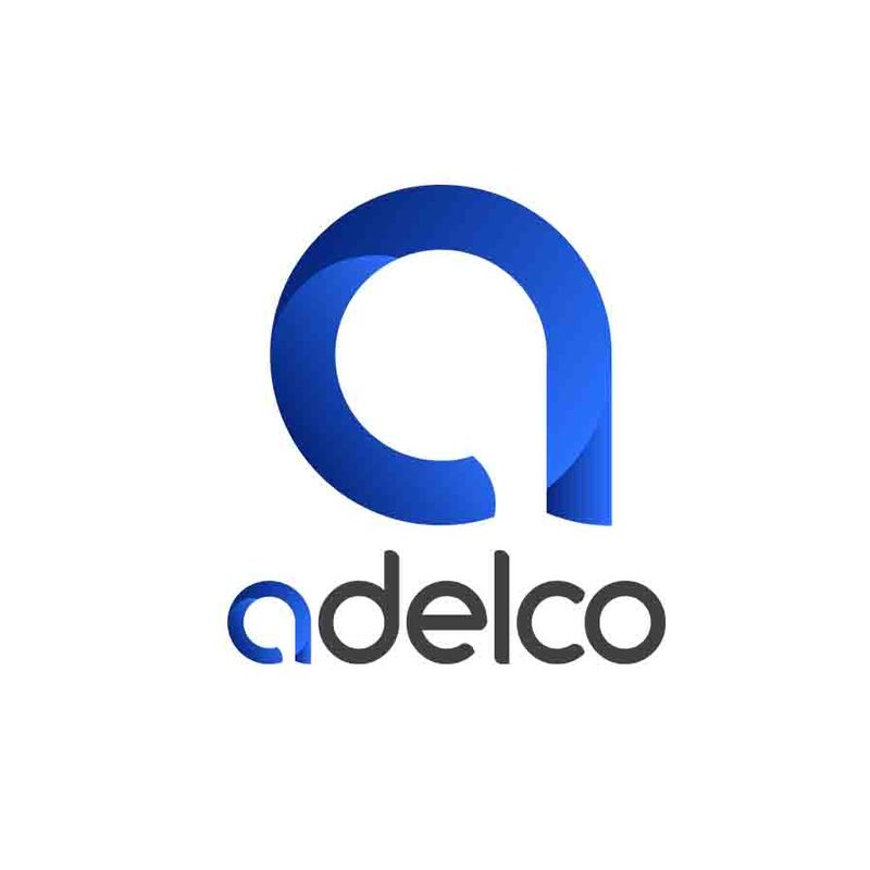
New logo
We needed a logo that represents us as a company, that is at the forefront of engineering and design. Embodying our modern and adaptable approach to both screen and digital print and product and representing our global reach.
Over the last 40 years Adelco have grown to be a well known and respected brand. Our decision to launch our new logo and brand identity better reflects our market leading position, and our technically advanced offerings to the market.
Although the name stays the same our new identity is innovative, contemporary and professional, adjectives that describes not only our image but the systems we design, manufacture and service.
Leigh Smith, CEO
The logo design represents our digital, modern and adaptable approach to all our products. The circular design represents our global footprint across six continents. The blue has been consistent with Adelco from the very beginning and it is important to keep that element of recognition as well as remembering our heritage. The new logo provokes a feeling of movement and inspiration and is designed to work across both digital and traditional channels.
Mark Smith, Managing Director
The new logo is a fluid symbol of this, in both shape and design. The circular design represents our global footprint. The new company font also embraces this. Montserrat is a contemporary sans-serif font with beautiful curves and well rounded corners, making it particularly easy to read. This will ensure continuity across all communications.
Colour
The ‘a’ symbol lends itself to the blue that Adelco is well known for. It is important to keep that element of recognition as well as bringing our history and reputation with us into the new logo.
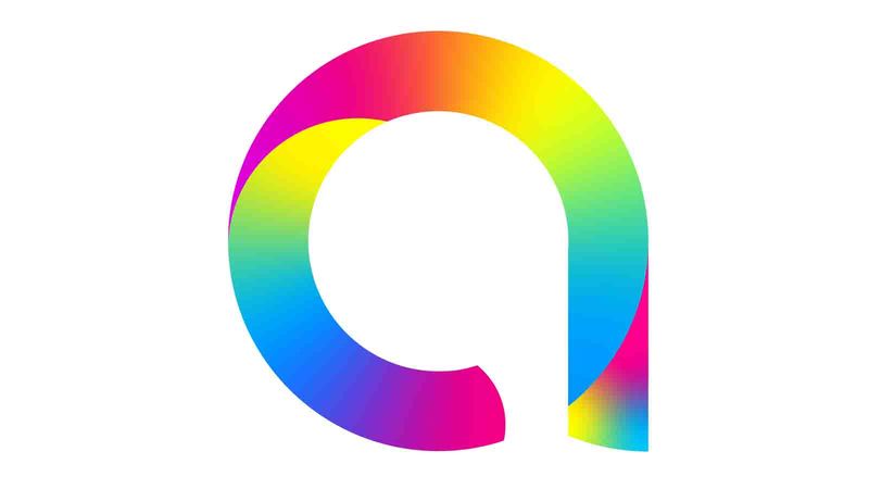
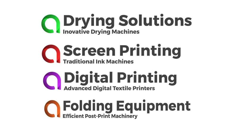
Colour is an important part of what we do, and we wanted to showcase the vibrancy and the technologic superiority of our machines and the prints they can produce. See below a multicoloured version of the logo which works well in print:
The versatility of this logo continues, with having different colour logos for different product ranges, this will assist our customers in navigating our portfolio both online and in our brochures. Ensure consistency throughout the company and all our documentation.
This logo is well suited to both digital and traditional platforms. We hope in time that this logo will be synonyms with Adelco and the qualities and values that we strive hard to achieve and maintain.

Recent articles
FESPA 2026 - Barcelona, Spain